"Watercolor Techniques"
 Masking:
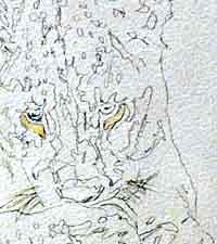
 When using masking fluid, it is so important to paint it in accurately. It should be used as if it were paint. So often, one is tempted to "generalize" when using masking fluid. In this detailed view, the masking fluid is easily visible because it is tinted yellow. There is a masking fluid on the market which is clear, but I find this very difficult to use because I can't see it on the page. Masking fluid is used to mask out areas which must remain white or light - such as the lion cub's whiskers and the "spark" in his eyes. This "spark" is very important as it gives life to the eyes of both humans and animals - I always mask this tiny dot of light out. TIP! The application of masking fluid causes many artists great heartache, but I have found an infallible way of applying it - without clogging up brushes. I use an ordinary bar of toilet soap and lightly coat the brush with it. Then I dab the brush on an old towel to get rid of excess moisture. Then I dip it into the masking fluid - and here's the important bit - NEVER reload the brush with masking fluid. Instead, when the fluid on the brush is used up, I go back to my water, back to my soap and back to my old towel ... and only THEN do I go back into my masking fluid. It is a bit tedious, but it saves brushes! |
 The First Layer:
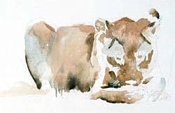
 Using a mixture of Cadmium Yellow, Geranium Lake Bluish (a magenta color), Burnt Umber and Cerulean Blue, I paint the first layer. I do not mix a big puddle of the required colour, preferring to mix as I paint so that even in this first stage, there is variation in colour and mixing can also happen on the page. There is also a variation in tone in this first layer, which is achieved by putting down a wash, then gently softening too-hard edges by dragging through the wet wash with a clean, damp brush. NOT wet, as this will cause backruns. Then I allow this layer to dry. |
 The Second Layer:
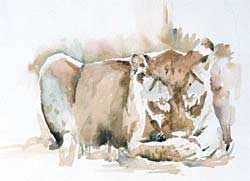
 Almost invariably, I will need to make the first layer darker. Watercolour always dries lighter, so now I will add another wash of the same 4 colours, darkening as necessary. I need to use my background (or, as I prefer to call it, "negative painting") to bring the form of the lion cub forward along his back and the right side of the painting - using the same colours, but allowing mixing to happen on the page and using more of the blue/pink mix, with less yellow. Cerulean Blue is used on its own in areas like the cub's back leg - notice that the top of this back leg is not painted at all, to show the effect of the strong sunlight. Geranium Lake Bluish is used for his bone. I also add a very soft wash of Burnt Umber while this layer is almost dry, to indicate the cub's spots. Did you know that lion cubs have spots? |
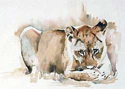 Darker Still:
 Once the second layer is completely dry, I find that I need to orientate myself by putting in some of my darkest darks. Here I have added Payne's Grey and Blue Black to the cub's ears, eyes, nose and claws. Also to the shape under his head and behind his paws. I also add a touch of Quinacridone Gold to the cub's face and back. |
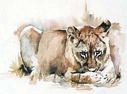 And Even Darker:
 This painting is done from photographic reference, which certainly makes my life easier. BUT a problem which often arises from using a photo of an animal is the "concertina" effect which can occur from using a powerful telefoto lens (as is the case here). The long lens tends to flatten the image - and here this is happening in the area between the cub's head and body. So I have to use my artistic licence to adjust the tones in this area, making them even darker. I remove the masking fluid by rubbing it with my finger and make adjustments if necessary. Here I added a very soft wash of yellow to the white patches around the eyes. The "background" is used only to further enhance the shape of the cub. The cub is anchored to the grass by rich darks - a mix of Burnt Umber and French Ultramarine. In the finished painting below, I have extended the background wash further up the page to create a more pleasing balance between the positive images and the unpainted page. |
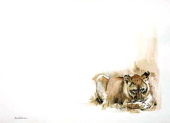
"Lion Cub and His Bone"
Watercolor
Size: 71 x 52cm (±28" x 20")
© 2000, Sue Dickinson
To view more of Sue Dickinson's work, please visit her web site at https://www.suedickinson.co.za/
Artshow.com | Artist Interviews and Demonstrations
Web pages and artwork at this site may not be duplicated or redistributed in any form without express permission.