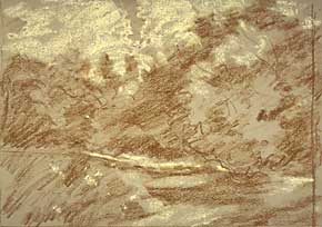
| Sequence I Working from a sketch made on location, I designed a new line and value composition. Working on size 8" X 10" sheet of Canson Mi-Tentes paper in a grey shade, I did a rough drawing using a vine charcoal, soft. I prefer drawing with this medium, since it for me is more spontaneous. Next, I placed the darkest values using more pressure on the charcoal. Then winding-up the block-in of the shapes, I used a white soft pastel for the clouds. |  |
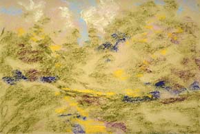
 | Sequence II Using the colors of the chart included, the blues of the sky were placed in loose shapes. I keep all areas simply done, using NO detail. This gives a first underlying color, which because it is used thinly, lightly, gives a base for the next pastel colors to be applied without smudging, or smearing. In the sky, I used pale violet, and pink. For the darks of the trees, deep blue, green and purple were applied lightly. |
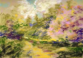
 Sequence III
 Using stronger colors and starting to put more definition, I now work on tree forms using more line, and adding more shapes to the clouds. Bright pink, orange and red were placed as undercolor for the blossoms.I now started drawing with a textural side stroke, in order to give movement as well as texture. You can observe this on the slope of the ground and the angle of the distant tree shapes. |
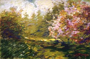
 Sequence IV
 Finally using more finished detail, being careful not to destroy the freshness and understatement, I add the blossoms, young green leaves and small branches, also some suggested daffodils on the grass in the shady area. My goal was to paint the mood of a chilly but sunny spring morning. It seems the final painting did have the certain duality I had hoped for. Though I had planned on placing figures in the scene, I decided to paint what I had discovered... a quiet, chilly morning on "Daffodil Hill". |
Artshow.com | Artist Interviews and Demonstrations
Copyright © 1999 Artshow.com. All rights reserved.
Web pages and artwork at this site may not be duplicated or redistributed in any form without express permission.