 STEP 1
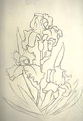
 The support is heavy illustration board prepared with a mixture of gesso, Elmer's glue, pumice, and acrylic for color, mixed with water. The color chosen for this demo was the complement of the subject matter. The composition was explored using extra-soft vine charcoal, as this is easily corrected by dusting off and re-drawing. When finalized this step was sprayed with fixatives. |
 STEP 2
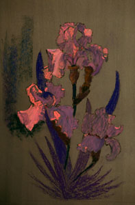
 Thin layers of blue-greens, red-violets and dark pinks establish the shadow areas of blossoms. As flowers fade quickly, they have to be accomplished prior to the background, other than quick notes to help establish the value relationships. Light coming through the blossom is a very important factor in depicting the transparency and warm "heart" of the bloom. Strong warms are applied to the center of the blossom to create this feeling. Some of the Iris blades are started with dark blue purple, others with dark umber for a variation of greens. Hard pastels are used to blend and soften the initial strokes of color. |
 STEP 3
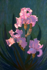
 Rich, vibrant colors are applied in the middle and light areas of the petals, using a light touch to create a layer of color that can be brought to completion with the addition of smaller areas of the lightest lights. English red, madder lake and orange-red were used for these areas, and the palest values of these pigments were used as the lights. It is always a challenge to delay the application of the "light" until the under painting is finalized. Strong color is easily toned down but impossible to recover if too much light has been used. |
 STEP 4
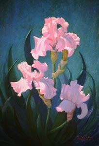
 The background is further established with several hues of blue-purple, green to blue green, with glazes of pale blue-green on top. To finalize this Iris "portrait", rounded edges were softened by blending the adjacent colors or values together, painting one over the other until the feeling of roundness is achieved. Other edges were sharpened by applying a darker or lighter value next to the desired edge. |
© 1999, Thelma Davis
Artshow.com | Artist Interviews and Demonstrations
Copyright © 1999 Artshow.com. All rights reserved.
Web pages and artwork at this site may not be duplicated or redistributed in any form without express permission.