
|
At the request of one a colleague, I am going to paint the following sunset from a photo which he sent to me. Although the demo will be painted in soft pastel, much of what I will be doing applies to any media. Before painting from a photo there are several things to consider and do:
1. Take several photos of the same location. When photographing, take shots before, during and following the sun setting. I sometimes have dozens of photos of just one subject. Photos taken before the sun sets are important for obtaining shadows information in particular. Cameras are notorious for killing shadow detail even with meticulous metering. Shadows can go flat, revealing only a silhouette. Even photo professionals find it difficult to tackle shadows. And as a painter, you can never have too much visual information. 2. Whenever possible, paint on location. Photos do not provide the same information as painting on location, no matter how many pictures you take. Even if you will paint primarily from photos there is nothing quite like painting on-site to capture information that photography misses. Sketch, make color notes, etc. live to use in tandem with your photos back in the studio. 3. Use only the best photos. Some photos are better left as photos and not be used for painting. You can't paint what you can't see. Use only the best photos of your subject. Have enlargements made from your negatives, or use a projector and hand magnifier to work from slides. Even if you deviate from the photo, knowing what you are deviating from takes the guesswork out of your efforts. If you paint a particular subject over and over again, you can make changes with more authority and confidence. There are also inherent problems with photographs that the painter must overcome. I will not address the subject in-depth here. Just to say to painters working from photographs -- it's essential that you learn as much as possible about photography's limitations and shortcomings before engaging in using them as the sole source for painting. 4. Be selective. Paint only those elements within a photo(s) that will produce a great painting. Leave unnecessary visual information out. |
OBSERVATIONS FROM THE PHOTO: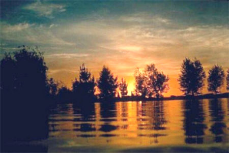 Here is the original web-ready photo I received. I have slightly lightened the photo as it was very dark. I observe the following from this picture... |
|
MY APPROACH FOR THIS PAINTING: |
|
MATERIALS TO BE USED: |
|
PROCESS I WILL USE: |
|
COMPOSITIONAL POSSIBILITIES: From this one photo alone, there are many possible compositions. Just a few are shown here:
Since the original picture has many shapes and no real detail, I will simplify my composition by repositioning and enlarging the focal point (the sun) to bring more attention to it. I like the upper left side of the sky, so I will move it and the left side trees further to the right. This is the final composition I have decided to paint from: 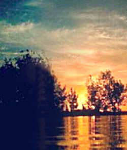
|
|
PLANNING THE PAINTING: I'll start with a piece of standard 19.5" x 25" Canson paper in a medium-value violet. This color complements the oranges. The painting overall will be low-key. To avoid having to cover a light paper with so much pastel, I start with this darker value. All the colors will "read" at all times, therefore, this paper color works best for me. In addition, the violet reads as "warm" even though it is an overall cool color. I use the "felt" side of the paper, so I do not have to fight the machined "dimples" of the opposite side. I use Homasote as my backing board surface with several additional sheets of the same Canson paper under my painting. This allows the surface some "give" yet is not mushy. If I paint on the Canson without extra pieces behind it, it will be like painting on a brick. Much pastel can be wasted without this extra cushion. |
| PAINTING: |
||
 |
With a dark blue-gray pastel I work out the largest shapes first. I have elected to lower the overall horizon to reveal more sky.
The original photo shows the sun not quite in the center, not quite to the right, tending to float visually. I strengthen the composition by moving it farther to the right. [Note: Learning the principle of the "Golden Mean" or "Golden Section" can give you more creativity and confidence when building your compositions.] I am going to remove some trees and move others to bring more continuity and unity to the whole piece (hopefully!) |
|
 |
I begin laying-in the darkest areas with the side of a dark blue-black pastel, keeping everything loose at first. If I commit a tight drawing early on, painting will become stiff and I'll be reluctant to move things when needed. I work around the entire painting, not just in one isolated area. The whole must be at the same level of "doneness" all along the way.
Also notice that I am indicating reflections as I create the trees. |
Next, I block in sky and water, but not as light in value as they will eventually be. I save the lightest lights and darkest darks for last. I cut into the negative areas left behind by the trees and water. Later I will adjust the positive -- back and forth until I achieve the effect I want. Remember that the positive and negative spaces hold equal importance. |
||
 |
 |
|
 |
I am beginning to lose my original sketch, so it's time to review the structure of my painting. I come back in with a NuPastel to check and restate proportions, make adjustments, and clarify edges before applying more color.
|
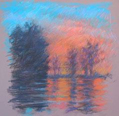 |
Now to the fun part -- really painting in earnest. I use the next higher dark values to build the shadows and tree shapes. Totally black silhouettes will give a "cutout" appearance. Even though nondescript, I want my trees to look like trees. I am not shooting for a likeness, but rather an impression or simplified version of this scene. The silhouettes will be lighter and more diffused than the original photo to compensate for the camera's loss of information. To create a sense of depth I lighten the most distant trees using a combination of medium violets oranges and blues.
|
 |
Now that the composition and basic colors are in, I indicate the sun and work more carefully in each area, comparing values, colors and intensities to one another. I constantly work to "knit" the colors using the edge of my pastel, laying colors side-by-side or grazing over top. This is how I avoid having to blend. I want the colors to be lively and rich even when they are dark. Working this way also keeps my colors clean.
|
 |
You'll notice there are basically two levels to this scene, a middle and background -- no foreground to speak of. I could bring the nearest water into focus, but to do so would make the water the focal point rather than the sun.
|
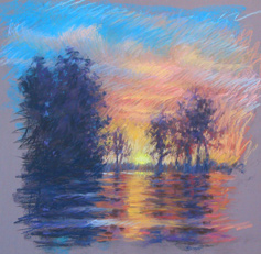 |
I have to be cautious of the clouds. Overworking or making the edges sharp here will draw too much attention to the sky. Therefore, I continue to simplify by scumbling medium tones over top.
|
 |
Next to starting a painting, this is my favorite part - the finish! Adding the glowing highlights and darkest darks is what makes a painting which utilizes value "sing". I apply thick pastel to the highlight areas while the shadows have a thinner application of paint. I work rapidly, back and forth adjusting color and value to achieve the effect I want.
|
|
I could continue, but this is where I'll stop for the final painting. Ordinarily I paint with more detail and a more "polished" finish, however this photo lacked the information necessary for a highly detailed piece. I decided that capturing the bold, rich color with simple open shapes would be best for this particular subject. In addition, I used more visible strokes so you could better follow what I've done.
Hope this will give you some insights and ideas for your next sunset! 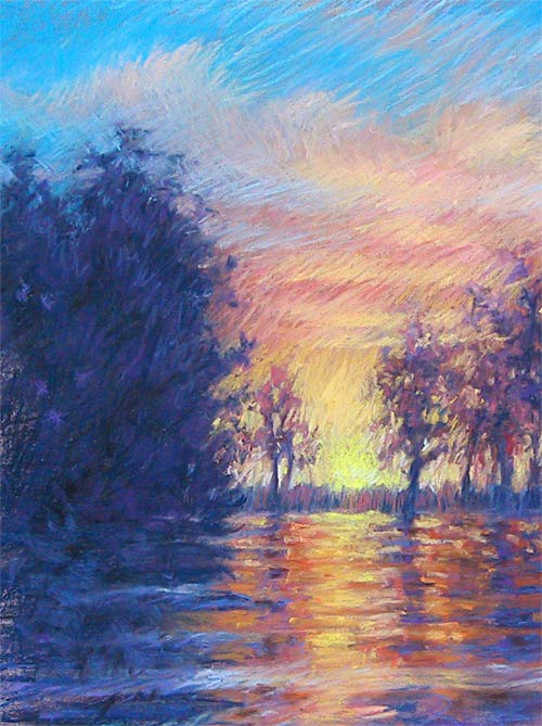
|
|
Visit L. Diane Johnson's website to view more of her work. |
Artshow.com | Artist Interviews and Demonstrations
Copyright © 2001 Artshow.com. All rights reserved.
Web pages and artwork at this site may not be duplicated or redistributed in any form without express permission.


