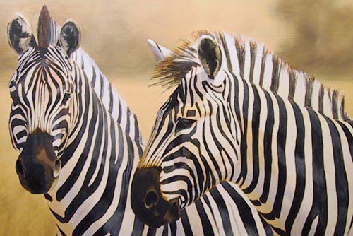
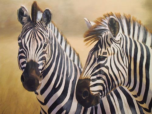
"Zebra"
by Jason Morgan

 |
|
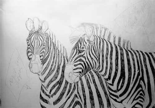
Above
you can see the working drawing (with notes). It has been drawn
to the size that I want the finished painting, approx. 24 in
x 16 1/2 in. I have drawn it this size for two reasons. Firstly,
it makes it much easier to transfer the drawing to the canvas.
And secondly, it gives me a real sense of the impact the painting's
size will make. Some paintings just don't make much impact if
they are not big enough. It's like the difference between seeing
a film on a TV or in the cinema.
|

|
|
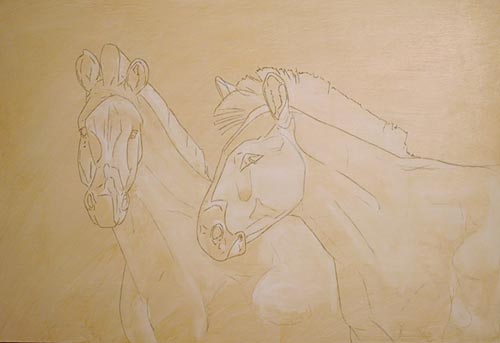
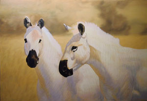
As
per my usual method, I have transferred the drawing to the canvas
using tracing paper. It was then sealed with a thin coat of
white acrylic paint. When this was completely dry (overnight)
I toned the canvas with a very thin coat of oil paint (thinned
with thinners). With the tone still wet and working very quickly
(before it dried) I wiped out with a tissue the main highlights.
This immediately gives the painting form and acts as a very
basic tonal underpainting.
|
 |
|
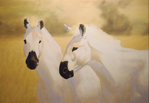
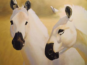
The
first coats of paint are applied quite thinly, adding a little
thinner and Liquin to the paint mixes. I have given the background
my usual blurry finish which will emphasize
the zebra more, and I have also started to block in the shadow
and highlight portions of the zebra. I have blocked in the darkest
darks (i.e. the eyes and nose areas) so that I can clearly judge
my shading against darks.
|

|
As
the zebra are black and white I had to concentrate on finding
the shadow and reflected light colours. Painting the shadows
a dirty colour would have lost all feeling of strong sunlight,
so as you can see I have chosen more lively colours to create
the form.
|

|
I
selected the colours by firstly looking very closely at my reference
slides, trying to ignore the black stripes and concentrating
on the whites. The reference wasn't the best but I could just
manage to find some purplish colour in there and raw sienna
reflected up from the grasses.
|
|
If
you find it difficult to see shadow colours, then you can use
a simple formula to help you know what you are probably
looking for. Object colour + complement is a good starting point,
with reflected light bouncing into the shadow. There are no
real formulas though, and close study of real lighting effects
is the best bet.
|
 |
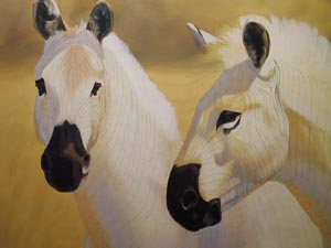
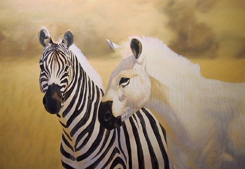
Another
coat or two has finished the shading. And now that it has dried,
I have drawn the stripes on the canvas by transferring them
from the pencil drawing. It would have been pointless drawing
them until this stage as the stripes would have just disappeared
under the first coats of paint.
|

|
I
have deliberately darkened this photo to show you more clearly
the faint stripe lines. As you can imagine I didn't want to
draw these more times than I had to.
|

|
|
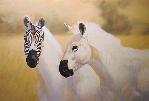
Above
you can see the first layer of dark stripes. I am not concerning
myself with the highlights on the stripes at this stage as it
is difficult enough to just get the correct stripes coloured
in. The dark mix is made from ultramarine blue and burnt umber.
Notice how much the stripes appear to bring the zebra forward.
The blurry background is now starting to look more realistic
(although the photo is making it appear too light at the top).
|
 |
Here
you can see how the colourful shadows and reflected areas are
starting to come in to their own, giving the zebra shape and
form, even with the flat dark stripes over the top. Notice also
how the direction and positioning of the stripes are following
the contour of the muscles. Now you can see why I spent so much
time drawing and shading the stripes on the working drawing.
I had to be sure that everything gave that same statement -
Form and Shape.
|

|
|
After
about 1 1/2 hours of painting the first coat of one zebra's stripes,
although I am very happy with the way things
are turning out, the stripes are starting to get a bit tedious
to paint. Oh well, only about another 1 1/2 hrs to go! with this
in mind I am now deliberately taking a 5 minute rest every 15
to 20 minutes. It's very easy at this stage to start rushing
things, and these breaks will allow me to concentrate better.
|
 |
|
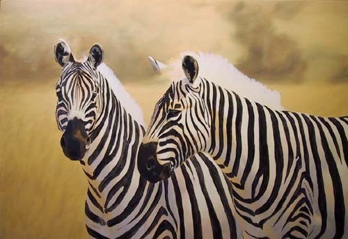
With
the stripes now blocked in on both zebra a real sense of depth
is starting to be achieved. Although the background (showing
too light again) is nothing more than blended pigment, anyone
looking at the painting will automatically assume that it is
distant bushes/trees and grass. This effect will be enhanced
in the later stages when I paint in just a few foreground grasses.
Notice also how the zebra now appear to be white, although there
is no area of pure white on them.
|

|
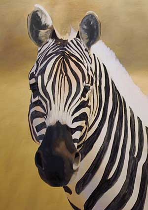
A
close-up of the head clearly shows the importance of the stripes
following the form and contours of the shape and musculature.
To
get the darkness of the stripes I had to give them two coats!
|
 |
|
With
the dark coat of the stripes completed and my hand rested, it's
time to add some highlights to them. These are simply lighter
tones painted very lightly over the darks. Notice how the highlights
add to the shape and form. The mane has been given it's first
coat - following the direction of the hair growth all the time.
|

|
I
wanted to add another element of depth to the painting - mid-distance,
so I have lightly painted in the suggestion of a bush in the
bottom left-hand corner, I think that it helps. Do you?
I
have also given the mane a further coat of paint (first one dried
overnight).
|
 |
|
Above
you can see the painting nearing completion. The mane is pretty
much done as is most of the highlighting. I have now started
to look at the finishing details, like hair under the chin, etc.
(you can't really see it on the pic, sorry). I have also strengthened
a few highlights by giving them a second coat of paint, and
softened the tips of the mane by giving it a light glaze.
|
 |
|
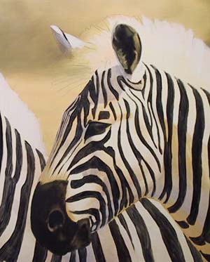
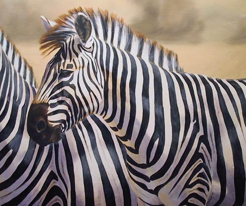
Notice
here how the shading on the body creates the sense of roundness
and form. Zebra are really like fat horses, so it is important
to emphasize the contours. You can clearly see how the highlights
on the black stripes now add to the effect of the belly area
being quite round.
Click here to see the final painting.
|
